



SEO Title: How to Style a Courtyard Wedding With Neutral Colors
Meta Description: Create an elegant courtyard wedding with ivory, champagne, beige, greenery, and warm neutral details. Discover timeless wedding design ideas for a garden venue near Atlanta.
Focus Keyword: neutral courtyard wedding
Secondary Keywords: garden wedding venue Atlanta, courtyard wedding ideas, Buford wedding venue, neutral wedding colors, historic wedding venue Georgia
Internal Link Suggestion: stonehedgevenue.com/weddings
Neutral wedding colors have a reputation for being simple.
But simple doesn’t have to mean plain.
In a garden courtyard, a carefully chosen neutral palette can feel sophisticated, romantic, and incredibly warm. Instead of competing with greenery, architecture, and natural surroundings, neutral colors allow those elements to become part of the design.
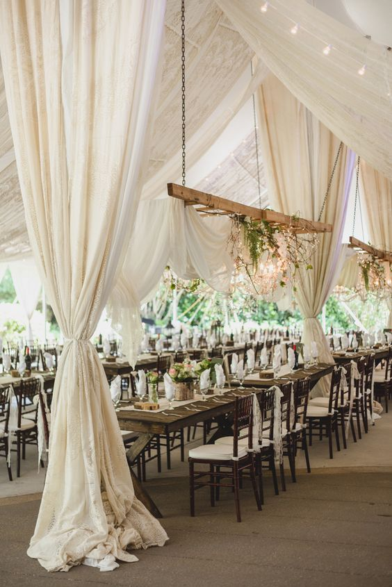
Think soft ivory against garden foliage. Champagne linens beneath candlelight. Cream florals beside historic architecture. Warm beige stationery paired with elegant glassware.
The result feels effortless because the venue and the décor aren’t fighting for attention.
If you’re dreaming of a neutral courtyard wedding, here’s how to create a celebration that feels layered, elegant, and timeless.
Start With More Than One Neutral
A neutral palette becomes much more interesting when it includes several related tones rather than one color repeated everywhere.
Consider combining:
- Ivory
- Cream
- Champagne
- Beige
- Taupe
- Warm white
- Soft gray
- Natural wood tones
These subtle differences create depth.
For example, ivory flowers against cream linens with champagne accents will feel much richer than using bright white for every detail.
The goal is softness, not sameness.
Let Greenery Become Your Natural Contrast
One of the greatest advantages of styling a courtyard wedding is that the garden already provides color.
You don’t necessarily need to add green artificially when you’re surrounded by it.
Allow trees, plants, and landscaping to become the contrast against your neutral palette.
This can make ivory ceremony flowers stand out beautifully while helping reception tables feel connected to the outdoor setting.
Instead of treating the garden as a background, think of it as part of your wedding color scheme.
Keep the Ceremony Design Light
A courtyard ceremony rarely needs excessive decoration.
If the space already has landscaping and architectural character, consider using florals strategically.
You might focus on:
- A simple ceremony arrangement
- Ivory aisle flowers
- Greenery
- Neutral chair details
- An understated welcome sign
Leaving some visual breathing room allows guests to appreciate the setting.
It also creates cleaner, more timeless ceremony photographs.
Use Texture to Keep Neutrals Interesting
When you’re working with a restrained color palette, texture becomes especially important.
Different materials prevent neutral wedding design from feeling flat.
Consider incorporating:
- Linen
- Velvet ribbon
- Handmade paper
- Natural wood
- Glass
- Ceramic details
- Soft floral textures
- Metallic accents
You don’t need all of these at once.
A few thoughtfully selected textures can add dimension without disturbing the simplicity of the overall design.
Choose Florals With Shape and Movement
Neutral flowers can still feel dramatic.
Rather than relying on color for visual impact, use shape, texture, and movement.
Your florist might combine ivory and cream flowers with greenery or other botanical elements to create arrangements that feel organic.
For a courtyard wedding, arrangements often look especially beautiful when they appear connected to the garden rather than overly structured.
Let the flowers enhance the landscape instead of competing with it.
Introduce Champagne or Gold Carefully
Metallic accents can bring warmth to a neutral palette.
Champagne, antique gold, or brushed metallic details may work beautifully in:
- Flatware
- Candleholders
- Frames
- Table numbers
- Signage
- Small decorative accents
The key is restraint.
You want the metallic elements to catch the light—not dominate the design.
Against historic architecture and garden greenery, small warm accents can create a particularly elegant effect.
Let Candlelight Warm the Palette
Neutral colors transform beautifully after sunset.
During the day, ivory and cream can feel light and airy.
In the evening, candlelight gives those same tones warmth and depth.
Consider layering reception lighting with:
- Taper candles
- Votives
- Lanterns
- String lights
- Warm ambient lighting
Always confirm your venue’s policies regarding open flames and lighting installations before finalizing your design.
Where real candles aren’t appropriate, high-quality flameless options can create a similar visual warmth.
Keep Reception Tables Refined
A neutral courtyard tablescape doesn’t need to be complicated.
A beautiful combination might include:
- Cream or ivory linens
- Neutral napkins
- Clear glassware
- Simple floral arrangements
- Warm metallic accents
- Candlelight
- Minimal place cards
The garden provides much of the visual interest around the table.
That allows the tablescape itself to feel calm and intentional.
Use Black as an Accent for a Modern Look
If you want your neutral wedding to feel slightly more contemporary, introduce a small amount of black.
Black can work particularly well in:
- Typography
- Menus
- Table numbers
- Signage
- Taper candles
- Formalwear
The contrast gives a soft palette definition without requiring another strong color.
Ivory, greenery, and black can feel especially sophisticated against historic architecture.
Keep Signage Clean and Simple
Neutral wedding design works beautifully with understated stationery.
Instead of elaborate signs filled with decorative elements, consider:
- Clean typography
- Warm white or cream backgrounds
- Subtle botanical details
- Black or dark-green lettering
- Simple frames
This keeps the design polished while allowing the courtyard and architecture to remain visible.
Consider the Venue’s Existing Colors
Before finalizing your palette, look carefully at the venue itself.
What colors already exist in the architecture?
Are there warm woods?
Brick?
Stone?
Greenery?
Neutral walls?
Rather than choosing your wedding colors independently, build a palette that complements the property.
This creates a more cohesive result and often reduces the amount of décor needed.
Neutral Colors and Historic Architecture
Neutral palettes work particularly well in historic settings because they don’t compete with architectural details.
Instead, they highlight them.
Cream flowers can soften an older exterior.
Champagne details can complement warm architectural tones.
Greenery can connect the garden to the reception.
Candlelight can bring out texture after sunset.
The overall effect feels intentional without making the historic property disappear beneath wedding décor.
A Neutral Courtyard Wedding at Stonehedge House
For couples searching for a garden wedding venue near Atlanta, Stonehedge House in Buford offers a historic home and garden courtyard that naturally complement a neutral wedding palette.
The venue accommodates celebrations of up to 125 guests, making it particularly suited to intimate and mid-sized courtyard weddings.
Stonehedge House also provides 50 on-site parking spaces, with nearby public parking available. Event pricing typically ranges from $4,500 to $6,000.
A palette of ivory, cream, champagne, greenery, and warm neutrals can work naturally with the property’s historic character rather than requiring couples to completely transform the setting.
Neutral Doesn’t Mean Minimal
A neutral wedding can still feel lush.
Romantic.
Layered.
Luxurious.
The difference is that visual interest comes from texture, lighting, flowers, architecture, and thoughtful details rather than a large number of competing colors.
That’s what makes neutral palettes so versatile.
They leave room for the venue—and the people—to stand out.
Let the Courtyard Be Part of the Design
The most successful courtyard weddings don’t treat the venue like an empty canvas.
They recognize that the garden, architecture, light, and surrounding textures are already part of the wedding design.
Neutral colors simply give those elements more room to shine.
So rather than asking how much décor you can add, consider asking:
What can we leave beautifully visible?
That small shift can create a wedding that feels elegant without being overdone, romantic without being overly styled, and timeless long after current trends have changed.
Book your private tour today and imagine your neutral wedding palette surrounded by the historic charm and garden courtyard of Stonehedge House in Buford.
Suggested Image Ideas
- Ivory-and-greenery ceremony design in the garden courtyard
- Neutral reception table with cream linens, champagne accents, and candles
- Newlyweds photographed against the historic home in soft neutral wedding attire
Instagram Caption
Ivory, champagne, greenery, and candlelight—the perfect recipe for a courtyard wedding that feels effortlessly timeless. 🤍🌿
Hashtags
#NeutralWedding #CourtyardWedding #AtlantaWeddingVenue #BufordWeddingVenue #StonehedgeHouse #GardenWedding #WeddingColorPalette #HistoricWeddingVenue #GeorgiaWedding #GeorgiaBride #WeddingDesign #AtlantaWeddings